By Alan Cheong (Reproduced with permission)
Having been an observer of the Singapore property market since the early 1990s, I can’t help but notice a cycle of repetition in the way analysis is done. As the various sectors of our real estate market are either facing challenges or at inflexion points, we can expect to see a repeat of storylines from previous cycles. This article looks at some of the common approaches taken by market watchers when making predictions and at why these can turn out to be an analysis of falsehoods.
Drawing parallels
It has been a common practice in the commercial world to draw parallels between past and present. Owing to its simplicity, very often, market observers use symmetry to back their position. Very often, they superimpose the current price pattern onto a historical price pattern where a cataclysmic event happened thereafter. The audience is then left to draw the conclusion that history is likely to repeat itself. Using the US stock market to illustrate this point, Chart 1 shows how the Dow Jones Industrial Average in the 2012-2014 period closely mirrored that of the 1928-1929 period. The reader is likely to conclude that the Dow will crash in the second half of 2014.
 Chart 1 – Source: Savills Research, Various
In the real estate market, inferences of this nature have often been made to link Singapore residential property prices to that of Hong Kong (HK). The comparison is tempting as historically, both cities are closely correlated to one another (see Chart 2).
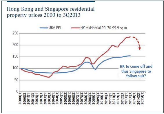 Chart 2 – Source: Savills Research, URA, Hong Kong Rating And Valuation Department
What happens is that if a market watcher believes HK residential prices will come off sharply, Singapore will follow suit, given that correlation.
Let us now revisit the case of the Dow. Chart 3 shows what happened. Those who forecast that the Dow would come off sharply in late 2014 were way off — a heavy price to pay for a false positive.
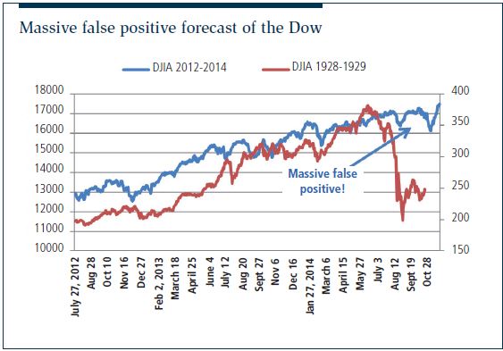
Chart 3 – Source: Savills Research, Various
What about drawing the conclusion that the Singapore property market would come off significantly when HK was expected by some market watchers to fall sharply by end-2015? Chart 4 shows HK did not come off, but instead went ballistic. On the other hand, the call that Singapore would come off was right, but for the wrong reason. Singapore prices fell because the effect of the cooling measures could not be overcome by the weight of money from China owing to our relative distance from the latter as compared to HK.
Drawing historical parallels is not an issue but it may not be reliable when there are no rational or economic underpinnings for the relationships. Data mining ensues and the output is often bent in order to justify the analyser’s viewpoint.
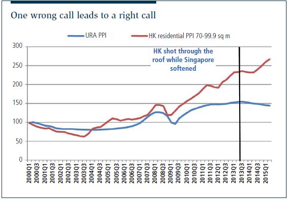 Chart 4 – Source: Savills Research, URA, Hong Kong Rating And Valuation Department
Demand chasing supply to continue
The adage “if you build, they will come” is something seasoned office marketing professionals have found to be true for decades. This observation has led to some believing that a constant supply-side programme for the office (or even retail) real-estate sector could be the best policy at the macro level. Hitherto, this approach has been quite successful in determining office demand, with regression models that incorporate supply as a predictor variable frequently outperforming by a mile compared with those that simply rely on fundamental drivers like GDP or Business and Financial Services GDP.
However, will this be the case when we have a bulge in supply coming on stream from 2016to 2018? There is a risk we have turned complacent and stopped questioning whether the past may hold true for the future. With major multinational financial institutions aggressively downsizing their headcount and reverting to their traditional credit business model, and commodity companies’ bottom lines languishing because of China’s economic slowdown, what is the new normal for CBD office demand? It cannot be that the demand function for at least the next five years will be similar to that in 2000-2013. If one does not start to question where demand is coming from and stays on auto-pilot, when the topology of the demand landscape changes, what is the potential fallout from the future development of large commercial spaces in regional centres and business parks?
Nevertheless, we still believe demand will chase supply; it is just that the long-term average annual demand will be reset lower. Once a new norm has been set, then each year’s annual demand should vary around that. At a time when we are heading into this epochal change in the landscape for office demand, the use of a singular model may reveal little and, chances are, historical models will tend to break down in the coming three years. This is especially so for the demand side. Chart 5 highlights five differently specified models for CBD Grade A office demand, which showed good historical fits and ex-post forecast performance. Unfortunately, with slower economic growth and a bulge in supply expected for 2016-2018, these models give a wide range of demand forecasts, especially for the year 2017. With the market on the cusp of a sea change, it creates the right conditions for some to prophesy market extremes. Using even the best model is not a preferred approach to forecasting.
The unfortunate thing is that policymakers and business planners direct forecasters to come up with answers or a range of answers. The forecasters would then choose the best model and then input several scenarios to provide a range of answers (under scenario analysis). What many do not realise, however, is that in many instances of constructing models, there are several specifications that are almost as good as the other. In that case, wouldn’t it be better to have a range of models that gives a range of forecasts instead? Only then can we pair the actual outcome with the model that gave the closest forecast to ascertain which driver(s) was responsible for, say, office demand in the years 2016, 2017 and 2018.
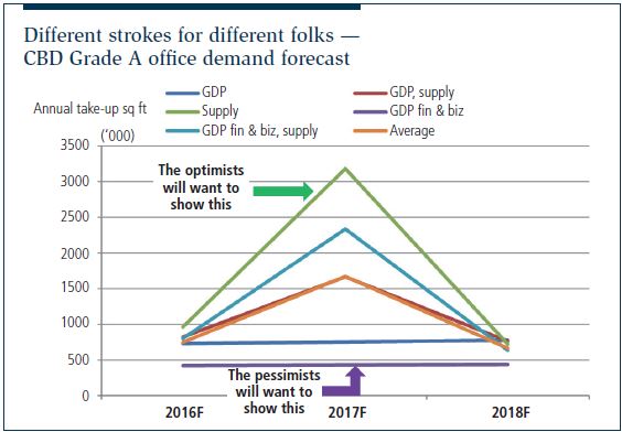 Chart 5 – Source: Savills Research, URA
Developers’ indirect discounts
Indirect discounts given by developers of private residential properties have always been a source of contention. The common grouse by third parties is that the amount given is opaque and as such, considered inequitable and a distortion to general property prices, and creates a false market by driving up sales from impulsive buying. Developers say it is not a prevalent practice and does not move stock. Previously, it was not easy to test out these claims as broad market data was not easily available on units sold with and without discounts. Since June 2015 however, the Urban Redevelopment Authority (URA) has been providing an additional field in its statistics showing the amount of indirect discount for each unit transacted. With this, we can now conduct some simple analysis to test these claims.
The first question is whether the practice of giving indirect discounts has been prevalent since June 2015. The answer is no. Excluding executive condominiums and new launches such as High Park Residences, of the 2,023 units sold in the primary market from June to October 2015 (according to Nov 2 data from URA Realis), only 92 received indirect discounts. Does that satisfactorily answer the question? No, not yet. As data on indirect discounts was not available prior to June 2015, it is not possible to determine whether it was common practice then. After all, developers could have been frequently handing out indirect discounts but, knowing that their actions would be in the public domain, reduced the practice from June. Anecdotal evidence gathered from residential project marketing specialist points to the infrequent use of developers’ indirect discounts for RCR and OCR properties. Thus, we can say that indirect discounts are not common practice.
With this new field, we can look to the June to October 2015 dataset to determine if indirect discounts have been able to move stock from projects that had their maiden launch beforehand, that is, projects that are already months past their initial launch. From a simple regression analysis, the answer is a surprising yes. Now comes the flap this may create. If indirect discounts were not widely practiced, but the release of information shows it has been effective in moving unsold units, and if developers include this as part of their marketing strategy, then more developers will resort to it.
In a nutshell, indirect discounts were not a widespread practice, only perceived to be so. With the latest dataset, we do find that they can move stock.
Conclusion
The above three examples are but a few perceptions that the public has been bombarded with, and which can be erroneous. There are several reasons for such practices. One is the pressure to create transaction volume, and thus commissions. The roles of market observer and analyst are then merged into one of public relations. As a result, research becomes a tool to generate marketing puff. The second is the need to “dumb” things down for the general public to digest. As a picture tells a thousand words, charts are frequently employed to convey the message. The more fanciful infographics a report has, the greater the assumed credibility. The appeal to the visual senses can override the lack of content and worse, lead to the wrong conclusion. In other words, the more visually attractive it gets, the more convincing it becomes.
To conclude, although one can sound the bugle about the dangerous ideas floating around the market, the way information is presented and interpreted is not likely to change. The public needs to think carefully about the information they are fed with.
Alan Cheong is head of research and consultancy at Savills Singapore. He can be reached at alan.cheong@savills.com.sg.
This article appeared in The Edge Property Pullout, Issue 704 (November 23, 2015) of The Edge Singapore.